 PhotoDeckHelp Center
Getting started: Design customization
In this section, we will start customizing the website design so that it matches more closely your brand, and so that you get an understanding of the customization possibilities offered within the system.
Changes may take a few minutes to appear on your website while the performance cache is refreshed.
Basic website settings
Head over to My website / Setup / Name & URL.

- Adjust your Website name (keep it short)
- If needed, adjust the URL to use under photodeck.com. You will always be able to connect to your own domain later on.
- Adjust your operating currency and the main language for your website
- Remember to hit Save!
Customizing my website design
A design in PhotoDeck is only concerned with the overall layout and the style of your website. Designs are like “skins”, the same features are always available regardless of your design. Your website has 2 designs, one for desktop computers, laptops and tablets, and the other, optimized for smartphones.
Within any design, it is also possible to greatly customize the way the images and galleries are displayed (via the Gallery Styles), what is shown on the front page when a visitor comes to your site, etc…
Video tutorial: customizing the design
The Design panel

This is where you choose and customize the overall “skin” for your website, both for the desktop/tablet and for the smartphone versions. What is done on this panel applies to all pages of your website.
This is where you customize the items that form the layout of your website: logo, navigation menu, colors, fonts, …
Apply - Revert
Changes you make to your design are not automatically applied to your live website, so you can try new options with no risk. If you are unhappy with the changes you have made, hit the Revert button to reset the work-in-progress design to what you have on the live website.
Click on Apply once you are happy with the changes. After that point, it is not possible to go back to a previous design or version.
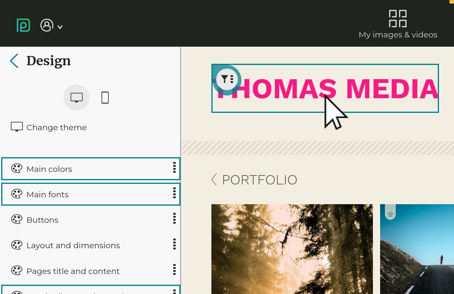
The customization tool
Changing the global colors allow to easily create a professional-looking and unique color palette, when the individual components’ colors are automatically computed:

The options follow a hierarchy: what is customized at the global level applies to any individual component, except if that component defines its own customization. Hovering with the mouse over an option group shows what components are affected by these options:

Similarly, clicking on the “filter” icon on a component (for example your social networks icons) will bring up all relevant customization options:

Every setting has a “switch” which allows to activate or deactivate its customization:

 Customized individual colors (left) vs colors automatically computed from main colors (right)
Gallery Display Styles
The gallery Display Styles allow you to customize how images are displayed, based on the purpose of the gallery they are in. Please refer to the section on Gallery Display Styles for further help.
PhotoDeck websites are designed to adapt automatically to small displays like tablets. When you change your design, it is therefore important that you make sure your website still looks great on tablets. If you don’t have a tablet, simply progressively make your browser window smaller until it is approximately half the width of a standard laptop display, and you will get a good feel on how it will behave on small tablets.
To get started, pick a theme
Head over to My website / Design and explore the base themes. First, look for a theme that has the layout you like most. Then, select the color variant that is closest to what you’d like.
Once you’ve found the base theme that is closest to what you wish, click on Apply. This will apply the theme to your website.
Preset themes are just starting point for your customization.
Using my own logo
To add your own logo:
- Prepare your logo in the size and format it will be displayed on your website. If it is meant to be displayed in a side column, it is best not to go over 250px of width, depending on the theme. We recommend saving the logo as a PNG file, with transparency if appropriate, or to use a SVG graphics file after running it through a SVG optimizer (e.g. via a specialized online service).
- Go to My website / Design and open the logo options by clicking on the filter icon above the logo and opening the logo options in the left-hand side column.
- Click on the Image option. In the popup window, upload your logo file, or select a file previously uploaded into your Visuals & assets.
- Your logo is now visible in the preview window. Once you are happy with it, click on Apply to apply the changes to your live website.
Adjust colors and fonts
You can also quickly adjust the colors and fonts used on your website, still under My website / Design
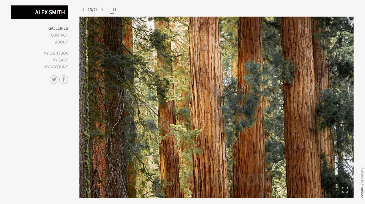
Display Styles: controlling how images are displayed
Gallery display styles make it easy to change the way galleries are displayed on your website, from full-screen auto-scaling slideshows to mosaic tile walls.
A gallery style applies to all galleries using that style.

Gallery styles allow you to display images and galleries in a different way, according to each gallery’s purpose.
For example, gallery styles let you:
- Display the image / video information under the preview, or behind an Info button, as well as select what information (metadata) to display ;
- Change the quality / resolution of images and videos displayed on your website ;
- Change the size and positioning of thumbnails ;
- Let galleries open on thumbnails or on their first image ;
- Let galleries be viewed as slideshows ;
- Activate the fullscreen mode ;
- Hide / remove certain components, like the Search ;
- Set how many thumbnails are displayed per page ;
- …
To change the Display Style used by a gallery, open that gallery under My images & videos, then click on the link displaying the current display style in use, located right below the gallery title.
Default gallery styles
Each theme includes the following default display styles:
| Style | What for? | What it does |
|---|---|---|
| Portfolio | To showcase your work with as little visual distraction as possible | Aesthetics first: large images, no distracting action buttons or metadata (so it’s not suitable for ecommerce or proofing galleries), automatic slideshow, no search box. |
| Proofing | Optimized for client galleries and to select images. | Uncropped thumbnails, easy access to proofing features and image information. |
| Standard | General-purpose style, also used for search results | Somewhere between the Portfolio and Proofing styles, good compromise between usability and aesthetics. |
| Blog | Blog index and blog posts | Displays a gallery like a blog: big previews on the same page, image descriptions readily visible as text, … |
Customizing gallery styles

The preview window lets you navigate and see changes as you make them
Enlarged images/videos
This section gives you complete control over how opened images and videos appear in your galleries. This is also the place to adjust slideshow behavior for full-screen auto-scaling slideshows using, for example, the Portfolio style.
It is in this section that you can adjust the size / quality /resolution of the images and videos displayed on your website.
Note that image quality on a website is always a compromise between:
- displayed size on screen
- quality
- loading time (its importance is too often overlooked)
You can adjust various settings in the gallery display styles to maximize quality:
- use a higher size - this will result in longer loading times
- turn upsizing off in the auto-scale settings
- reduce the allowed crop
- also make sure that you upload files that are at least 3000px wide.
Image/video thumbnails
This section controls the thumbnails that open the actual images and videos of a gallery.
Choose from great presets such as the magic mosaic wall tile, or edit small details like whether or not to display download icons on the thumbnails.
Gallery covers
This section controls the cover thumbnails that open sub-galleries, like the main “Galleries” gallery.
For example, you can try here different ways to display the gallery titles on or under their thumbnails.
A notable option here is the Click on gallery cover opens: parameter. This will dictate if visitors see a large image / slideshow or thumbnails when they first enter a gallery.
Thumbnails pages
You will find here options that apply to pages of both gallery covers and image/video thumbnails.
Hide components in this display style
This section allows you to hide parts of your design in the galleries that use this gallery style.
Changing your website’s frontpage
The front page (“home”) is what visitors first see when they go to your website URL. It can be changed under My website / Front page.
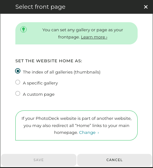
The front page can be:
- The index of all galleries (thumbnails). This is the default. Hidden galleries are excluded.
- A specific gallery. For example, you can display a portfolio gallery with a selection of your most unique shots and videos (see below to create an impressive frontpage slideshow).
Alternatively, if you have organized your galleries by categories (e.g. “Portfolio”, “Archive”, …), you can also put the most important top-level gallery/category as the frontpage. The index (thumbnails) of sub-galleries under it will then be displayed. - A custom page, if you prefer to have a free-form page on your frontpage, for example with a full-page background slideshow (see tutorial below). You can select a different frontpage for your smartphone website.
If you set a specific gallery as the frontpage, you will need to make sure that the other galleries are accessible via links in your navigation menu. Refer to the section on menus for further help!
TUTORIAL 1: displaying a full-bleed background image, video or slideshow on your frontpage
Frontpage slideshow with multiple images and taking the text from the image titles
- Create a new custom page under My website / Pages not in menu ;
- Leave the page content blank, and click the Banner / background button ;
- Select the Site background template, optionally add the text that will be displayed over the slideshow, and hit the Create button ;
- Select the gallery you want to take the slideshow images / videos from. You can also hand-pick the images you want to include (the slideshow can be limited to a single image or video)
- Adjust the settings under the Texts section to taste. If you display several images, instead of (or in addition to) a fixed text, you can also use the images titles to have the text change with each image. You can also adjust the slideshow luminosity and text color for legibility ;
- Close the banner / background popup, and under the page’s Page settings tab, activate the Make this page the front page checkbox.
TUTORIAL 2: Displaying an auto-scaling slideshow on your frontpage
- Set your frontpage to be a specific gallery, one that contains the images you want to display (see above). It can one of your existing galleries, or a new gallery created for that purpose.
- Make sure that gallery uses the default “Portfolio” display style. (You can also use a different gallery style, but it must be set to open galleries to their first image, with both auto-scaling and slideshow enabled.)
- If needed, adjust the slideshow timer, loop type, transition style and maximum image crop by editing the display style. You will also be able to hide the Selection and e-commerce buttons if appropriate.
- Optional: if you wish, you can also hide the gallery so that it doesn’t appear in the galleries thumbnails index.
The size and layout of the slideshow within the page will be directly based on your design.
Going further with design customization
It is possible to go further in customizing your design, via the Advanced tab of the Design editor, as well as by customizing the gallery Display Styles.
Note that this can be a time-consuming task without direct impact to your business. Unless you are only building a simple portfolio website, we recommend that at this point in this guide, you move on to populating your website and setup ecommerce and/or proofing features.